Plotting#
We present some examples for how to use the basic plotting functions in the python interface for GVEC. Note that these are not intended for advanced plotting, but for quickly visualising some basic properties. We will use the same elliptic stellarator as in the tutorial Elliptic Stellarator(🌐) for the plotting examples.
import gvec
params = {
"ProjectName": "test_plotting",
"which_hmap": 1,
"PhiEdge": 1.0,
"iota": {"type": "polynomial", "coefs": [0.625, 0.35]},
"pres": {
"type": "polynomial",
"coefs": [1.0, -1.0],
"scale": 1000.0,
},
"nfp": 3,
"X1_b_cos": {(0, 0): 3.0, (1, 0): 1.0, (1, 1): 0.4},
"X2_b_sin": {(1, 0): 1.0, (1, 1): -0.4, (0, 1): -0.25},
"init_average_axis": True,
"sgrid_nElems": 2,
"X1_mn_max": [3, 3],
"X2_mn_max": [3, 3],
"LA_mn_max": [3, 3],
"X1X2_deg": 5,
"LA_deg": 5,
"totalIter": 1000,
"minimize_tol": 1.0e-6,
}
try:
state = gvec.find_state()
except ValueError:
run = gvec.run(params)
state = run.state
GVEC - completed 0/2 stages: |>|.|
GVEC - completed 1/2 stages: |=|>|
GVEC finished after 1.0 seconds using 1000 iterations (totalIter = 1000) with |force| = 2.60e-05 (minimize_tol = 1.00e-06)
WARNING /home/docs/checkouts/readthedocs.org/user_builds/gvec/envs/writhe_twist_linking/lib/python3.10/site-packages/gvec/core/run.py:876: UserWarning: Force tolerance was not reached! |force|: 2.60e-05, minimize_tol: 1.00e-06
warnings.warn(
Note that all 1D and 2D plotting functions return the matplotlib figure and axis objects, or a figure and array of axis objects if multiple subplots are output.
1D plots#
Radial profiles#
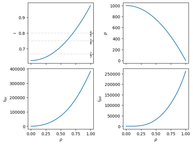
The first 1D plot is for radial profiles, plot_radial_profile(🌐), i.e. scalar functions of \(\rho\). Note that only scalar quantities can be evaluated for these plots. The defaults will give you \(\iota\), pressure, and the toroidal and poloidal current. Plots of \(\iota\) will also show the largest three rational numbers.
fig, axs = state.plot_radial_profile()
WARNING Computation of `I_pol` uses `rho=1.000000e-04` instead of the magnetic axis.
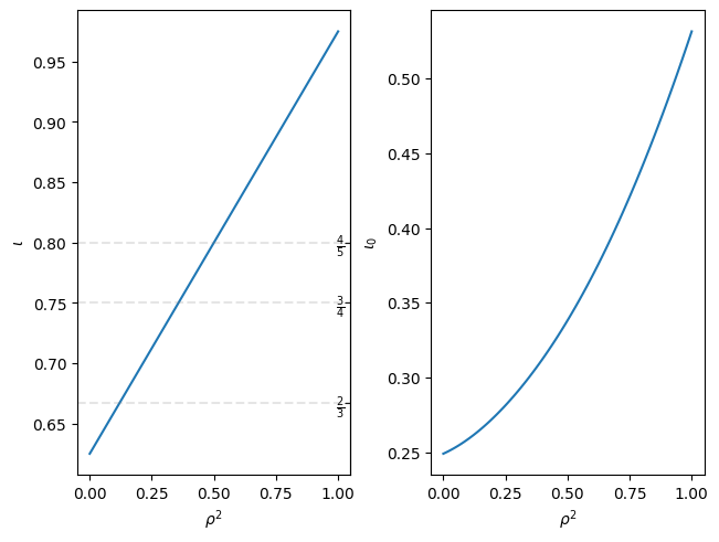
Note that you can also switch the x-axis to plot \(\rho^2\) instead of \(\rho\). Quantities can be changed by specifying a list of the evaluation quantities (or string if a single quantity).
fig, axs = state.plot_radial_profile(
["iota", "iota_0"], xaxis="rho_squared"
)
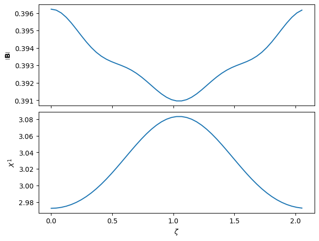
Magnetic axis#
Properties along the magnetic axis can be plotted with plot_on_axis(🌐). Since some derived quantities cannot be evaluated on axis,
this will automatically use a quadratic extrapolation to generate the values for plotting.
Note that we have specified the subplot_grid here, which defines the row,col of the layout of the subplots. This is not required unless you want a specific grid layout. As with the previous set of plots, the \(x\)-axis will automatically be shared between the columns.
fig, axs = state.plot_on_axis(
quantities=["mod_B", "X1"], subplot_grid=[2, 1]
)
2D plotting#
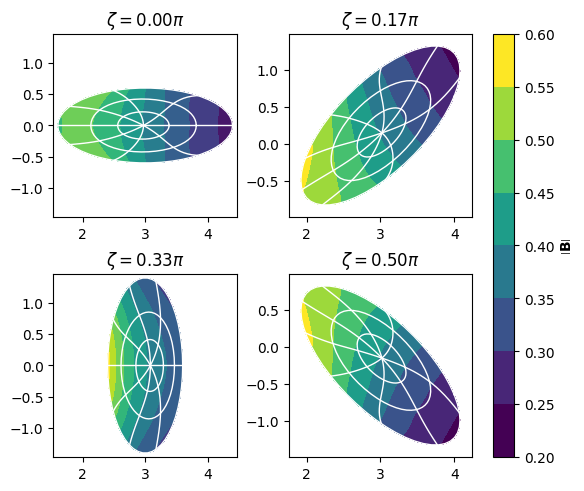
Poloidal slice plots#
For plotting poloidal slices we use plot_poloidal_plane(🌐).
We can lock or unlock the \(X^1\) and \(X^2\) values on the \(x\) and \(y\) axes by specifying share_axis=True/False (by default this is False). By default we plot \(|\mathbf{B}|\), and add contours of fixed \(\rho\) and \(\vartheta^\star\) values (PEST coordinates) in white.
fig, axs = state.plot_poloidal_plane(zeta=4)
Flux surface plots#
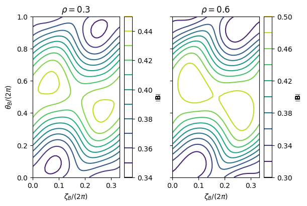
For plotting values on specific flux surfaces we use plot_on_flux_surface(🌐). Note that multiple flux surfaces can be shown at once by specifying a list or numpy.ndarray of flux surfaces labels. By default only the last closed flux surface (GVEC boundary) is plotted.
We also plot in Boozer coordinates, but this can be changed to either PEST or \((\vartheta,\zeta)\) coordinates by setting sfl="pest" or sfl=None respectively.
Finally, note that kwargs specific for matplotlib.pyplot.subplots can be handed to any 1D or 2D plotting function by the dictionary input, here we change the size of the plot using this feature.
fig, axs = state.plot_on_flux_surface(
rho=[0.3, 0.6], plot_kwargs={"figsize": (6, 4)}
)
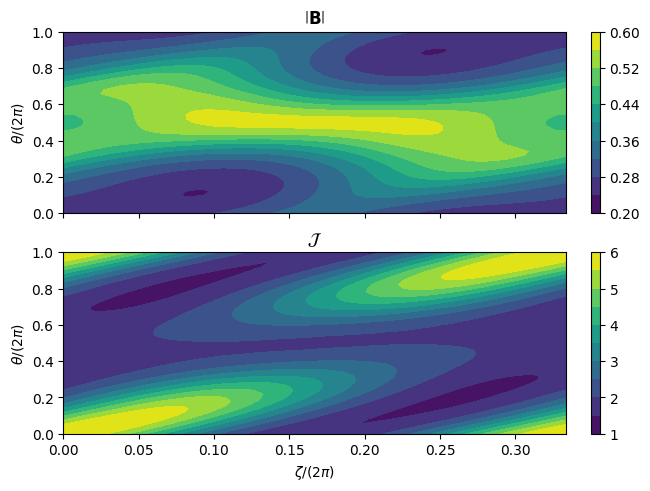
Note that we can also evaluate different values on the same flux surface by specifying the quantities rather than multiple rho values (currently we cannot do both). The quantities should be scalar values, as with the 1D plots.
In the plot below we also display filled contours by changing the style, and show the quantities in regular \((\vartheta,\zeta)\) coordinates rather than straight-field-line coordinates.
fig, axs = state.plot_on_flux_surface(
quantities=["mod_B", "Jac"],
subplot_grid=[2, 1],
sfl=None,
style="filled-contour",
)
Help#
Before moving on to the 3D plotting functions, note that for the list of inputs for any function you can always call help on the plotting function
help(state.plot_radial_profile)
Help on method plot_radial_profile in module gvec.plotting.plots1d:
plot_radial_profile(quantities: str | list[str] = ['iota', 'p', 'I_tor', 'I_pol'], nrho: int | numpy.ndarray = 101, subplot_grid: list[int] | None = None, xaxis: Literal['rho', 'rho_squared'] = 'rho', n_rationals: int = 3, plot_kwargs: dict = {}) method of gvec.core.state.State instance
Plot the radial profile of given equilibrium quantities.
Parameters
----------
state : GVEC state object
quantities : str, list[str], optional
Default is ``["iota","p","I_tor","I_pol"]``.
nrho : int, numpy.ndarray
The number of or specific 1D array of radial points to plot at.
Default is ``101``
subplot_grid : list[int], None, optional
The grid shape for the subplots. If ``None``, grid will be automatically determined.
Default is ``None``.
xaxis : ``"rho"`` or ``"rho_squared"``, optional
What quantity to plot on the x axis.
Default is ``"rho"``.
n_rationals : int, optional
If non-zero, show the largest $n$ rationals on any ``iota`` profile plot.
Default ``3``
plot_kwargs: dict, optional
Any ``**kwargs`` to send to the ``plt.figure()`` function.
For example ``plot_kwargs={'figsize': (8,8)}``. See the `matplotlib documentation <https://matplotlib.org/stable/api/_as_gen/matplotlib.pyplot.figure.html>`_ for a list of kwargs.
Returns
-------
``matplotlib.pyplot.figure`` object and ``numpy.ndarray`` of ``matplotlib.axis._axis.Axes`` object(s).
3D plotting#
For 3D plotting we use plotly as a backend.
To plot the boundary we only need the state file and the resolution of the plot, using plot_3d_surface(🌐).
Note that we can also specify the quantity we want to plot with
the quantities keyword, by default \(\|B\|\) will be plotted on the boundary.
Unlike the previous plots which return a figure and axis, 3D plots only return a plotly.Figure object.
Note that you may need a version of plotly<6.0 in order to display the plots in a jupyter notebook.
fig = state.plot_3d_surface()
fig.show();
One can also plot the full boundary surface:
fig = state.plot_3d_surface(
quantity="L_gradB", rho=0.5, ntheta=31, nzeta=41, period="full"
)
fig.show();
and for example als multiple surfaces on half a field period, and pass surface plot plotly arguments, like opacity.
fig = state.plot_3d_surface(
quantity="p",
rho=[0.25, 0.5, 0.75, 1.0],
ntheta=21,
nzeta=41,
period="half",
surface_kwargs=dict(opacity=0.5),
)
fig.show();
The value and position of the surface being plotting can be changed in the same way as the previous plots.
If for some reason plotly does not show, there is an optional input, to_file (default None),
which can be set to a string to write the plot to a file in your current working directory.